
Incorporating Text with Laser Sintering
Laser sintering makes it possible to incorporate text directly into a part for identification or aesthetic reasons. For the greatest chance of success, follow these tips.
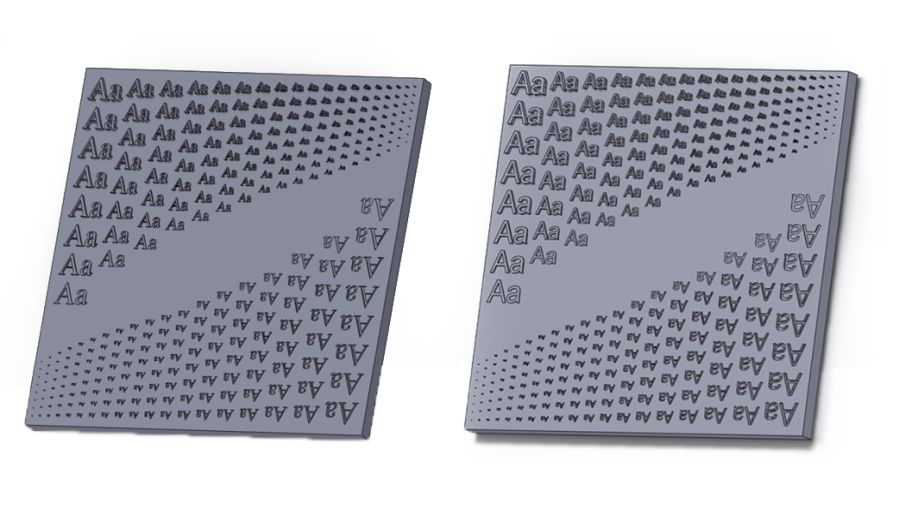
These images represent the two plates used in the study, serif on the left and sans-serif on the right.
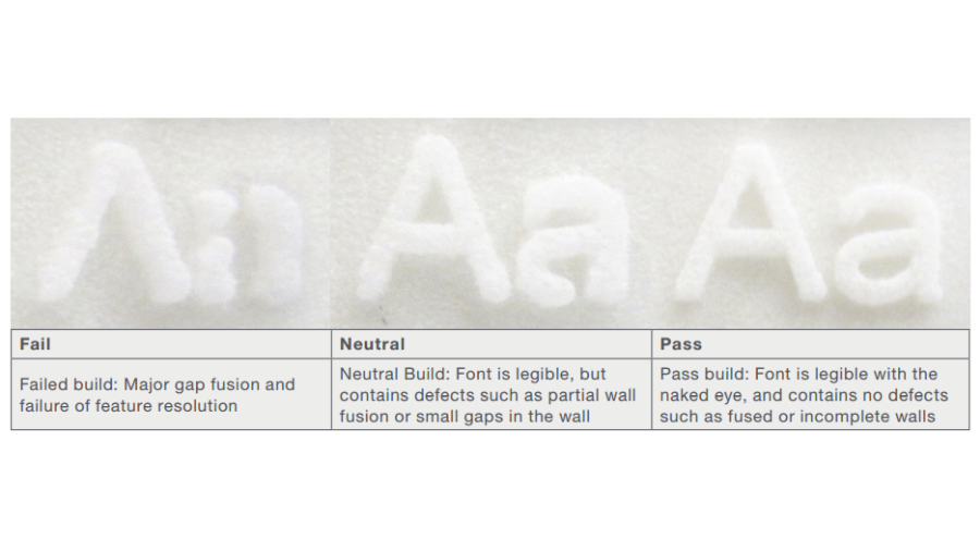
This table shows the pass/fail criterion for raised sans-serif text.
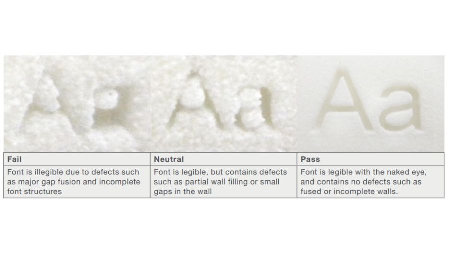
Pass/fail criterion for recessed sans-serif text.
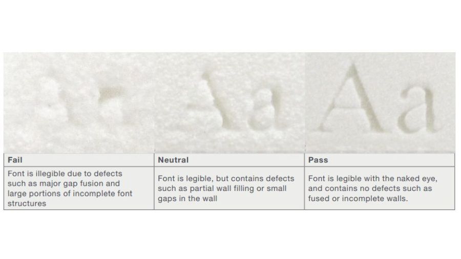
This table shows the pass/fail criterion for recessed serif text.

Pass/fail criterion for recessed serif text.
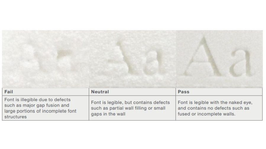
Pass/fail criterion for recessed serif text.


The laser sintering (LS) build process can easily incorporate text directly into parts for aesthetic and/or practical purposes. Aesthetically, text can make the end product more attractive—like a logo or name. Text is also used for more practical purposes like tracking or serialization, making product identification easy and rubbing, sanding or painting over the embedded text virtually impossible.
To better understand the specific parameters of text on LS parts, a research team in a sponsored study between Stratasys Direct Manufacturing and the University of Texas at Austin built two plates, one each in horizontal and vertical orientation, and tested the following capabilities:


- Font type, both serif and sans-serif options.
- Font size, ranging from 1 to 36, as determined by a typical word processor.
- Height gradations, changed in 0.24-mm increments.
- Text embossed or recessed into the plates.
The goal of the study was to determine if directly incorporating text into 3D-printed parts for design or brand purposes is feasible or even preferable depending on the application and project timeline.
The fonts were tested against size and type along with the font’s height above or below the plate’s surface and whether the lettering should face downskin (downward), away from the laser, or upskin (upward), towards the laser. Each test was determined a pass or a fail. Pass denotes the font was legible to the naked eye without defects. A fail meant the font was illegible because of gaps or incompleteness within the font.
The study found the following for serif fonts:
- Recessed text offers a better resolution at a font size of 14 or higher accompanied by a minimum depth of 0.025".
- In a vertical orientation, optimum quality is lost in font sizes 12 to 14.
- In a horizontal orientation, optimum quality is lost in size 28.
The study also found the following for sans-serif fonts:
- Raised fonts degraded in quality at size 20.
- In a vertical orientation, optimum quality is lost at font size 14.
- In a horizontal orientation, optimum quality is lost at font size 24.
- Font size 14 and smaller is illegible when the part is built vertically and the font is recessed.
- Fonts smaller than size 24 are illegible when the part is built horizontally and the font is raised.
Based on these findings the following is recommended:
- Both serif and sans-serif fonts should be recessed for highest success rates.
- Parts should be built with text in a vertical orientation.
Serif fonts are best with an upskin orientation.
Related Content
-
What is Powder Bed Fusion 3D Printing?
Whether in metal or polymer, with a laser or an electron beam, powder bed fusion (PBF) is one of the most widely used 3D printing techniques.
-
Airless Basketball Shows Promise of 3D Printed Lattices: The Cool Parts Show Bonus
Successfully matching the performance of a standard basketball demonstrates the control possible over the mechanical properties of digital materials.
-
8 Cool Parts From RAPID+TCT 2022: The Cool Parts Show #46
AM parts for applications from automotive to aircraft to furniture, in materials including ceramic, foam, metal and copper-coated polymer.


